How-to guide · Accessibility settings Turn on high contrast

Actionhigh-contrast
Audience Vision Age
Time Under 15 seconds
Permissions None
What this is: A single toggle on Aside’s Accessibility settings page that swaps the soft warm-paper palette for a higher-contrast variant — deeper inks for body text, stronger separations between cards, harder edges on hairlines. Useful in bright sun, with low vision, or any time the default warm-paper palette feels too soft to read at a glance. Toggle it on, toggle it off; the change is immediate.
Try it now

From inside Aside:

Settings → Accessibility → Higher contrast (toggle)

The whole app re-themes the moment the toggle clicks on. Toggle it back off if you change your mind — nothing here is one-way.

Step by step

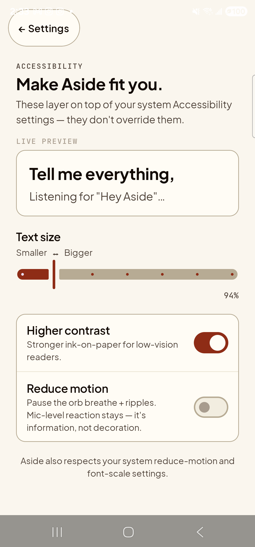
  1. Open Aside’s Settings → Accessibility

    Tap the gear icon at the top-right of Aside’s main screen, then tap the Accessibility card. The Accessibility page lists three controls: text size at the top, then Higher contrast, then Reduce motion, with a footnote at the bottom.

    The Aside Accessibility settings page in its default warm-paper appearance. Top-left: a clay-colored ‘← Settings’ pill button. Below it, the mono eyebrow ‘ACCESSIBILITY’ and the bold title ‘Make Aside fit you.’ Below that, the body line ‘These layer on top of your system Accessibility settings — they don’t override them.’ Below the eyebrow ‘LIVE PREVIEW’, a paper-colored card with the bold line ‘Tell me everything,’ and the caption ‘Listening for
    Default warm-paper palette. The Higher contrast toggle is the next tap target, currently off.
  2. Tap the toggle

    Tap anywhere on the Higher contrast row — or specifically on the toggle on the right. The toggle slides to the on position and the entire page re-renders in the higher-contrast palette: card backgrounds shift fractionally cooler, the body type uses a deeper ink, the hairline borders between sections are darker and slightly thicker. The change is instant.

    The same Aside Accessibility settings page, immediately after toggling Higher contrast on. The Higher contrast toggle on the right of its row is now in the active clay-red ON state — the visual cue most clearly confirming the change. Across the rest of the page the differences are subtle on the device’s warm-paper baseline: the live preview card still shows ‘Tell me everything,’ and the caption ‘Listening for
    Higher-contrast palette applied. Same content, deeper inks, harder edges. Compare side-by-side with step 1.
  3. Back out and check the main screen

    Tap back twice to return to the Aside main screen. The whole app is now in the higher-contrast palette. The orb is unchanged in shape but its core may render fractionally darker, the prompt “Tell me everything,” is in deeper ink, and the bottom toolbar pills have stronger borders.

    The Aside main screen at idle, with higher contrast enabled. Across the top: the ‘Aside’ wordmark, the status pill ‘● IDLE’, the cost counter ‘$5.953 today’, and the ‘NEW’ link top-right. Centered is the warm-paper orb, breathing. Below the orb the bold prompt ‘Tell me everything,’ and the caption ‘Tap the orb or type below.’ The clay-colored ‘Make Aside my assistant’ pill is centered below the captions. Bottom: the row of mono pills ‘history’, ‘type’, ‘muted’, ‘memory · 4’, then the build-stamp footer ‘Aside 0.2.6 · 1f482727ffbc-dirty · 2026-05-06T12:58:21Z’. The visual difference from the default palette is subtle on this warm-paper baseline — body type reads marginally crisper, section separations a touch darker. The clay accent color is intentionally unchanged in the higher-contrast palette.
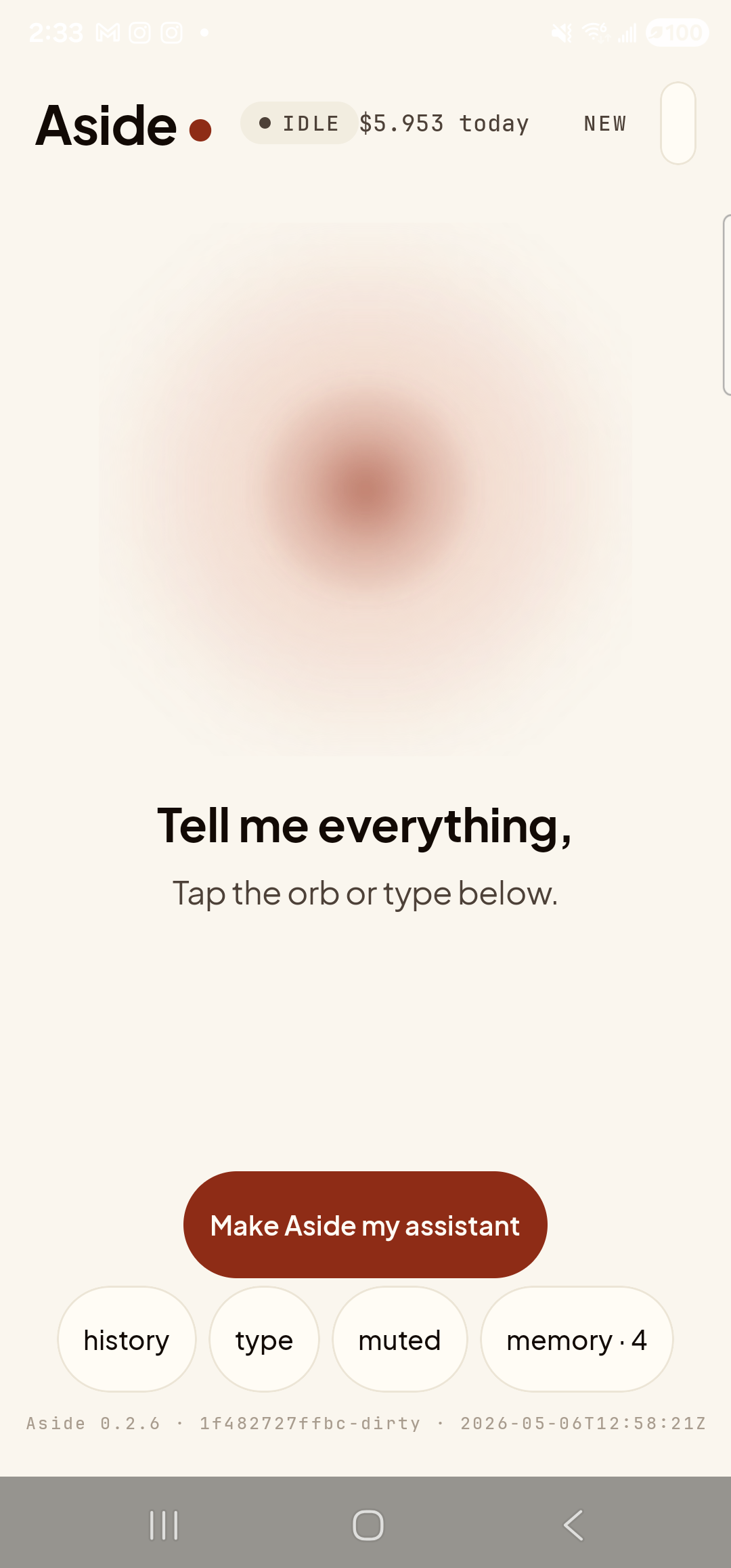
    Main screen in higher-contrast. Same composition; deeper ink, stronger separations.
  4. Toggle it back off if you don’t want it

    To revert: gear → Accessibility → tap Higher contrast again. The toggle moves back to off and the warm-paper palette returns instantly. Nothing here is one-way and your text-size choice is preserved either way.

    The Aside Accessibility settings page back in its default warm-paper appearance after toggling Higher contrast off again. The Higher contrast toggle is back in its inactive gray OFF state. The text-size slider still reads ‘94%’; the Reduce motion row remains in its gray OFF state. Otherwise the page is visually identical to the screenshot from step 1.
    Toggled back off. Settings are persistent: this choice survives an app restart.
System contrast still applies: On Android 14+ your phone has its own Settings → Accessibility → Increase contrast toggle. Aside’s in-app toggle is independent — turning either on increases contrast in Aside; turning the system one on increases contrast in every app.
Note: The clay accent color (the Make Aside my assistant button, the slider thumb, the action chip) is intentionally kept the same warm clay in both palettes — a single visual anchor that doesn’t move. It still meets WCAG AA contrast against both backgrounds; we just don’t harden it further.